Improving your home with colour
There are a thousand ways to improve your home and, in this blog, we’ll look at the intricacies of colour and how it can be used for home improvements.

Relationship between colours
The colour wheel illustrates the relationship between colours. Complementary colours are always opposite, for example – pairing a dark blue couch with a brass or copper coffee table will look amazing. These are the colours which make the most impact when teamed together – they really pop! This is because you can’t make blue more orange and you can’t make orange more blue – they are polar opposites on the wheel.
Other ways to use a colour wheel include:
Monochromatic – variations of the same colour. (eg: deep purple, mauve and lilac).
Triadic – looking at a colour wheel, make a triangle (equal sides) by selecting 3 colours. You can then work with different variations of these 3 colours.
Contrasting – using colours that aren’t from the same colour family, but somehow seem to work together. It is harder to achieve harmony, but when you do it can be striking!
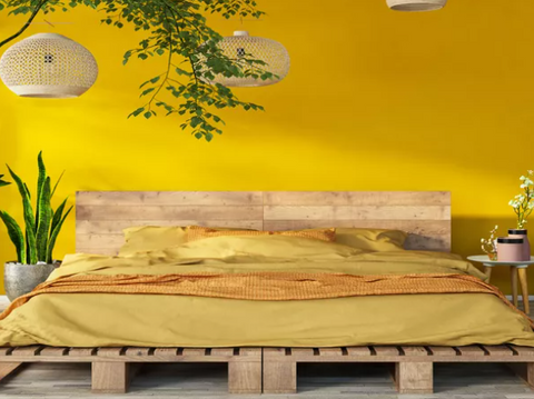
TIP: Colours that work well with black are dramatic shades like antique gold, mustard or earthy tones.

Light and colour
Understanding the light exposure in your space is key when improving your home. Always remember colours look different in different lights. If you don’t have much natural, don’t worry, there are lots of artificial light options to compensate for the lack of natural light.
TIP: Lightbulbs tinted yellow, pink or red accentuates warm colours. These are great in your lounge as they soften the mood, while blue and white lightbulbs enhance colder tones.
Paint and colour
Painting walls is another great way to improve your home with colour. Although most people love colour, they stay away in fear that their house will no longer appeal to other buyers. But who wants a house that looks like everything else on the market? Besides, a feature wall can be easily and cheaply remedied.
TIP: Feature walls work best in spaces occupied for short periods, such as hallways, laundries or dining rooms.
If strong colours aren’t you’re cup of tea and you prefer to have lighter shades on the walls, don’t assume that you have to use that same colour on every surface in the house. This can result in a boring space.
TIP: Resene colours are grouped in colour variants, such as eight, half, quarter and double strengths of the same colour.
Add depth and interest by using a full-strength on the walls, triple-strength on a feature wall, a half-strength on the trims and a quarter-strength on the ceiling.
TIP: Harrisons carpets are matched to Resene paint colours making it easy to update your flooring.
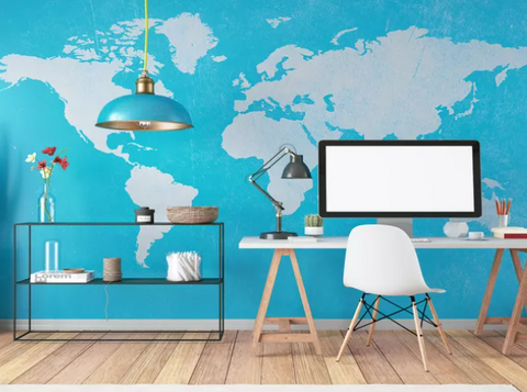
Office and colour
The office is a great starting point when introducing colour. It’s usually separate from the main living areas and can uphold its own identity. Perhaps use a wallpaper that you’re not comfortable using in a larger space of your home. Be brave and think bright, dramatic and bold!
TIP: Research shows greenery boosts brainpower and makes us more attentive, so consider a foliage wallpaper.

Kitchen and colour
Keeping up with trends is key. White on white is out, with darker colours now gracing magazine covers (eg: charcoal benchtops with matching cabinetry).
If your budget is small, paint plant pots in an accent colour or display the benchtop with coloured tea/coffee containers.
TIP: Resene has a range of water and oil-based enamel paints that will ensure that your kitchen surfaces are durable.

Free test pot for Harrisons customers at Resene
During August & September Resene are giving away a free test pot to all Harrisons customers. Simply print out this blog, or show it on your phone to receive your free test pot.